
Excel Charts – How do you create a chart from a Data Subtotals sheet? This is how…
![]() On a course last week, we had a good request from an attendee. They asked how to create a chart from a Data Subtotal sheet but only showing the subtotals and not the details. As it was such a good request, we decided to do this week’s blog on it!
On a course last week, we had a good request from an attendee. They asked how to create a chart from a Data Subtotal sheet but only showing the subtotals and not the details. As it was such a good request, we decided to do this week’s blog on it!
Data Subtotals allow you to quickly add in subtotals and totals in to your data after you have sorted it in some order. The subtotals are then applied on each change in the sorted data, for example at each change in department or in location.
Below are the steps to firstly apply the Subtotals to the data and then to create the chart. Once you have read the steps, click on the button below to download the spreadsheet and give it a go!
Steps for creating Excel charts from a data subtotals sheet:
- Sort data into warehouse sequence (Data Sort)
- Use Data Subtotals to show the stock values summed by warehouse
- Choose Outline 2 (from left hand side)
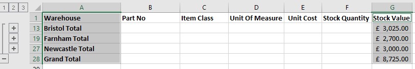
** Now the trick here is to show only visible cells, so press F5 and choose Special and select visible cells only – this has to be done for certain versions of Excel, but it doesn’t hurt to do it even if your version doesn’t require it to **
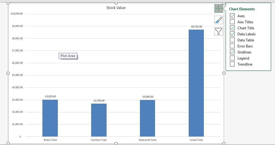
- Now select the warehouses and the stock values
- Press F11 to create a chart sheet. Choose to show Data Labels from Chart Elements (little + top right of chart)
We always enjoy having different requests or queries on our courses as they are often something that we haven’t thought about ourselves!
Quite a few of our hints and tips that are on our website have come from a query on a course whereas some are just from popular topics on our courses.
Liked this week’s hint and tip on creating Excel charts from Data Subtotals? Why not take a look at our previous one on learning in Excel through games?