
Excel exposure: Colour in Excel – Excel has gone colour mad!
This week’s blog focusses on colour in Excel. We’ve done this before so it contains a new feature in Excel 365 as well as recapping on a traditional one that we have covered already in a previous hint and tip.
Maps In Excel
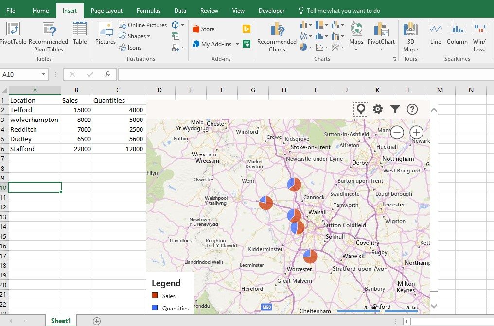
This new Add in is found on the Add in gallery of the Insert Ribbon. Maps in Excel allows you to display your data in a more visual way than just using text and displaying the figures next to it. This more visual approach can often be more appropriate and effective depending on what you are displaying the data for and who to. In the example above, you can see how the data is laid our clearly in the top left corner of the Excel worksheet but the Map that takes up most of the worksheet gives a bit more information and detail in displaying the locations visually. This could be beneficial if a comparison was needed to be made in how far each location was from each other.
Essentially, it gives you your data in a more visually descriptive layout compared to just having a table.
Conditional Formatting
Using this flexible feature on the Home ribbon brings data to life. All the conditions are managed so that the split of data relating to colours can be easily changed.
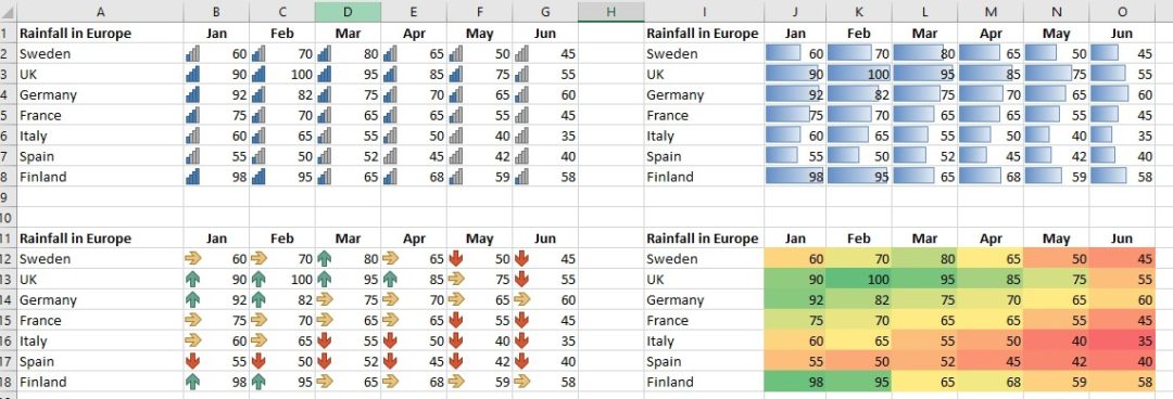
In the example above, the conditional formatting is able to add more colour to the data in the spreadsheet. This colour can very quickly give an overview of the data without having to look too closely at the individual figures. Using both icons and colour formatting is useful for making large amounts of data easier to read, show trends or quickly locate any issues/problems.
Like this post on Excel exposure? For more details on it and our courses please visit our website here or phone 07903 840105. You can also see our previous post here on pivot tables in Excel.