
Charts from Data with Error Messages – do you know how to create a chart from data that has error messages in it that you don’t want plotted?
![]() This week’s hint and tip is on how to create a chart from data with error messages in Excel. Charts are a well used feature in Excel and used by many to display their data visually. We cover charts on our Intermediate Excel training course and get asked lots of questions on them during it. A query came through recently from someone having trouble with error messages being plotted as a point on his line graph. We enjoyed coming up with this solution and so decided to do a hint and tip on it to share it with you. We are going to go through it now below.
This week’s hint and tip is on how to create a chart from data with error messages in Excel. Charts are a well used feature in Excel and used by many to display their data visually. We cover charts on our Intermediate Excel training course and get asked lots of questions on them during it. A query came through recently from someone having trouble with error messages being plotted as a point on his line graph. We enjoyed coming up with this solution and so decided to do a hint and tip on it to share it with you. We are going to go through it now below.
Error messages in Data
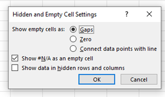 When creating a chart, anything that you select will be plotted as a point however this may not always be what you want. There is a ‘Hidden and Empty Cell Settings’ option that you can choose how empty cells are shown. As well as this, there is also an option to show the #N/A error message as an empty cell, which can be very useful. However there is only the option to show just that one error message as an empty cell, not every error message.
This was the issue that the person who sent us the query had come across. The error message in his data was the #DIV/O! one and so this was being plotted as points in his graph.
We will now show you below the solution we found for him.
The problem….
Below is a screenshot of the issue that was presented in the query.
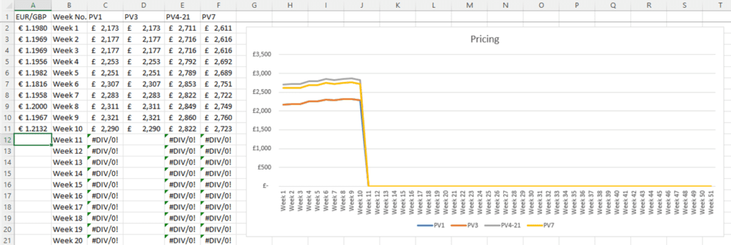
In the data above, formulas have already been inserted ready for raw data to be typed in. This would normally be fine but the formula involves diving and so has produced an error message. The person wanted the chart to only show the points from the weeks that have already been filled in. So in this case just week 1-10 and then week 11 onwards to be left ’empty’ on the chart.
Below you will find out solution!
…the solution!
Below is the screenshot of the solution we found.
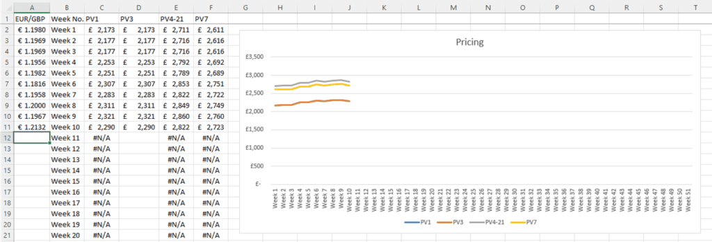
As you can see above, the solution we found was to ‘replace’ the error message with a #N/A error message. This is useful as you can tick the setting to not plot it on a chart.
To do this, we used two formulas in Excel and nested one inside the other.
The Nested Formulas
The formula we used was: =IF(ISERROR(D11/$A12),NA()) and we will go through how it works now (you can also listen to the explanation too in the video below):
- ISERROR formula. This tells you if a calculation or formula in a cell has produced or contains an error or not. In our formula above, the ISERROR(D11/$A12) part is telling us if the calculation in our cell is producing an error. In our case it is and so gives an answer of TRUE
- IF Statement. This formula allows you to have a logical test and the option for a value if it is true and a value if it is false. In our formula above, we have nested the ISERROR formula inside an IF statement as the logical test. We then filled in just the ‘value if true’ part with NA(). Typing NA() in the formula returns into a cell the #N/A error message
The video below goes through how to fix the issue of error messages being plotted on a chart in the spreadsheet attached here. (clicking here will download a copy to your computer so you can try it out!). We hope that you find the video useful and enjoy learning about it!
Take a look below at the video to find out more!
We hope you liked this hint and tip on the creating charts from data with error messages, why not take a look at our previous one on creating charts in Excel after hiding rows?