
Inserting Charts in PowerPoint – how do I insert a chart into a slide in my presentation?
![]() This week’s hint and tip is looking at inserting charts into a slide within the PowerPoint package. We cover this on our Basic PowerPoint training course but we also decided to do a hint and tip on it. We are going to go through it now below.
This week’s hint and tip is looking at inserting charts into a slide within the PowerPoint package. We cover this on our Basic PowerPoint training course but we also decided to do a hint and tip on it. We are going to go through it now below.
Inserting a Chart
We are going to cover two ways in which you can insert a chart into a PowerPoint presentation slide. Charts are a great way of being able to visually display your data, rather than just including a lot of numbers on a slide. They can also be a good way of showing trends in figures, for example sales.
First Way – using the Insert Tab
The first way to insert a chart is through the use of the Insert Tab.
Insert a new slide into your presentation and make sure that the slide layout applied is Title Only or blank if you don’t need a Title box.
To insert a chart, firstly click on the Insert Tab and click on the Chart button on the ribbon.
![]()
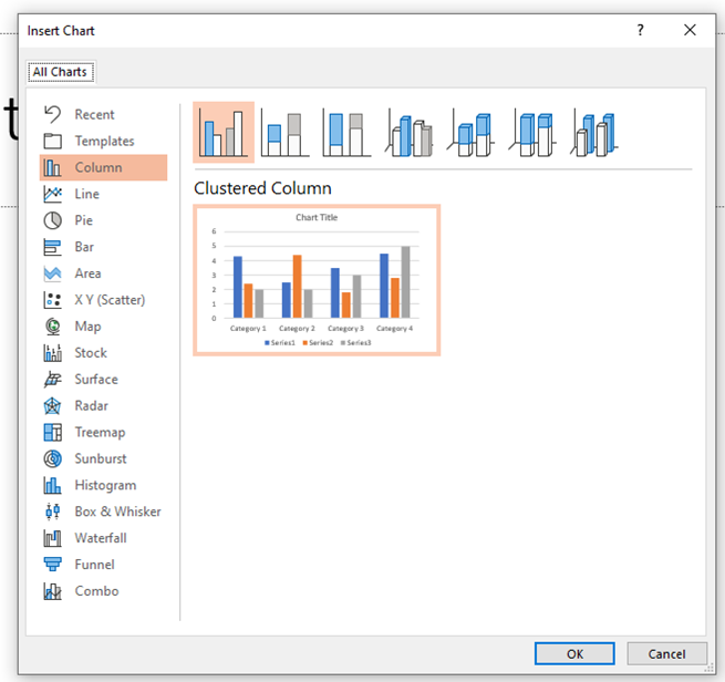
Once you click on this button, the pop up window below should appear on your screen. From here you can choose the style of chart you wish and then click OK.

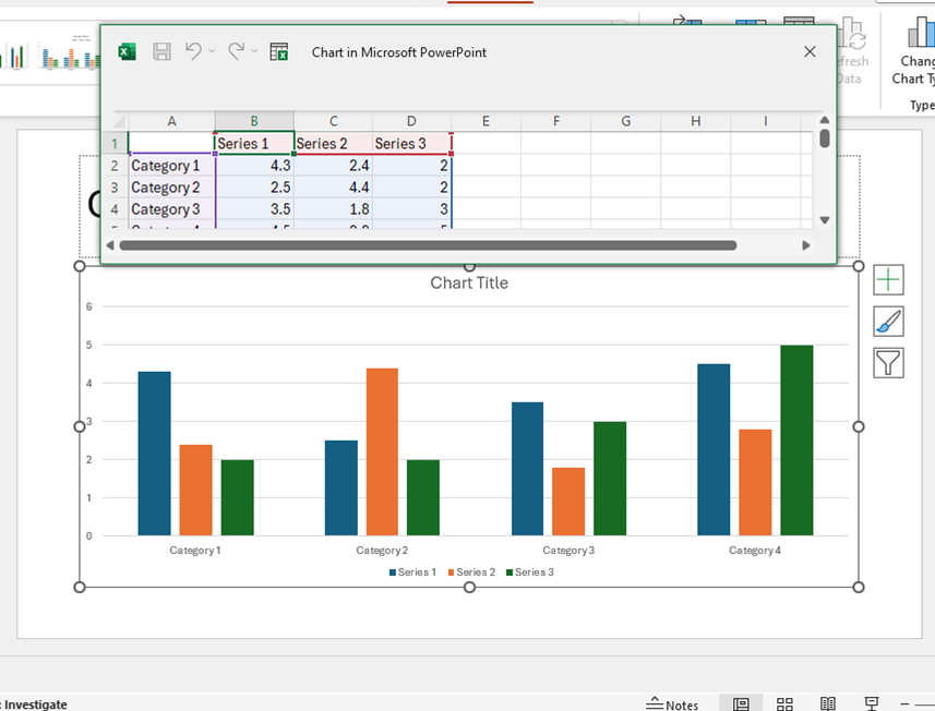
This will then insert a chart in to your presentation for you. You will notice from the screenshot that it inserts a chart for you and gives you a small window of a simple Excel spreadsheet with some sample data in it. This data is there to just show what the chart will look like.
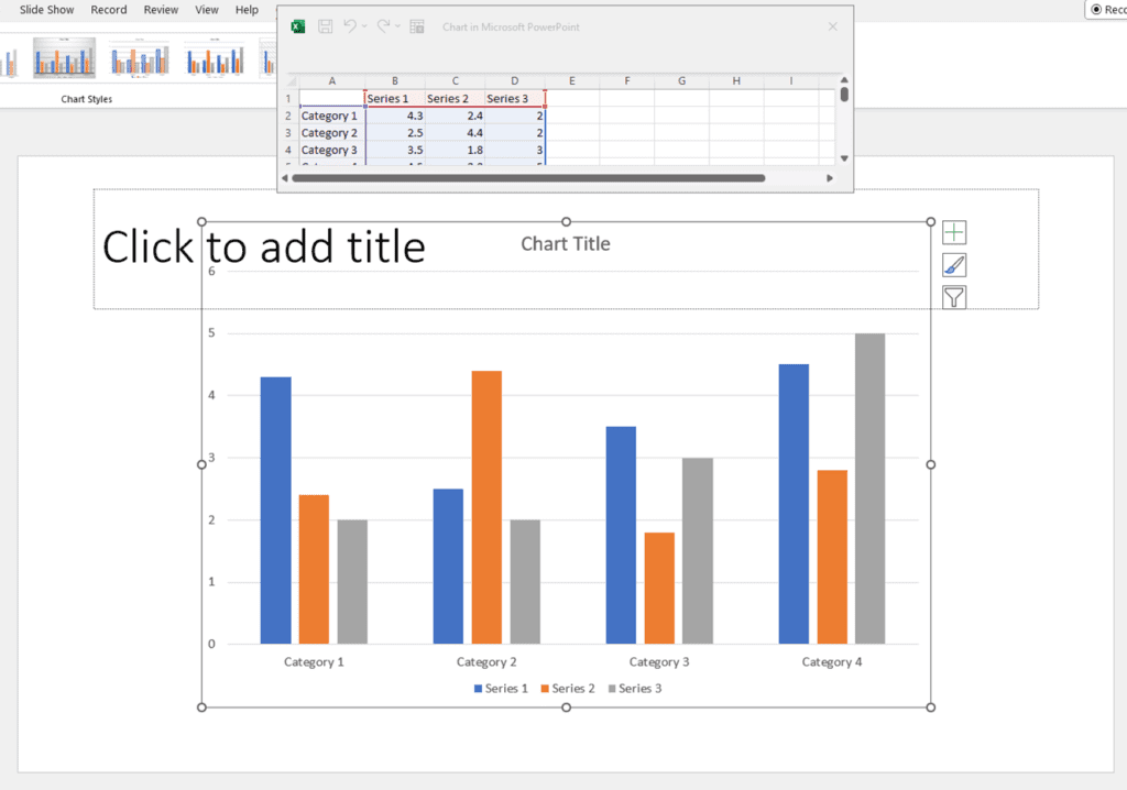
You are then able to edit the category and series names and values to what you need them to be. As you do this in the spreadsheet, it will automatically update in the chart on your slide.
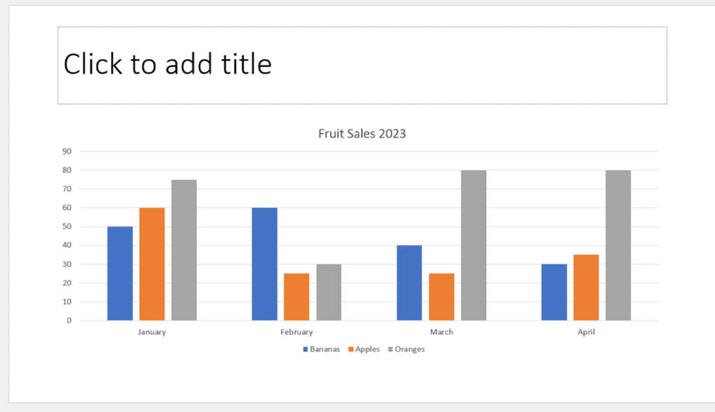
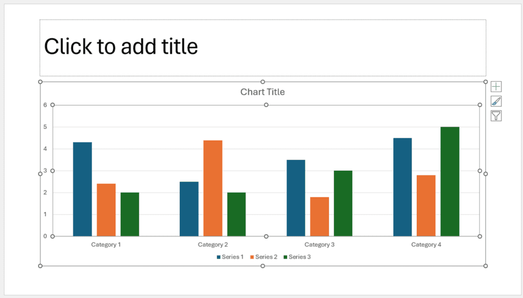
 Once you have typed in all the data you need for your chart, you can click on the cross in the top corner of the Excel spreadsheet to close down that window. This will then leave your chart by itself in your presentation slide ready to add any further details to it or a title to the slide itself.
Second Way – Using the Insert Chart option in the content box
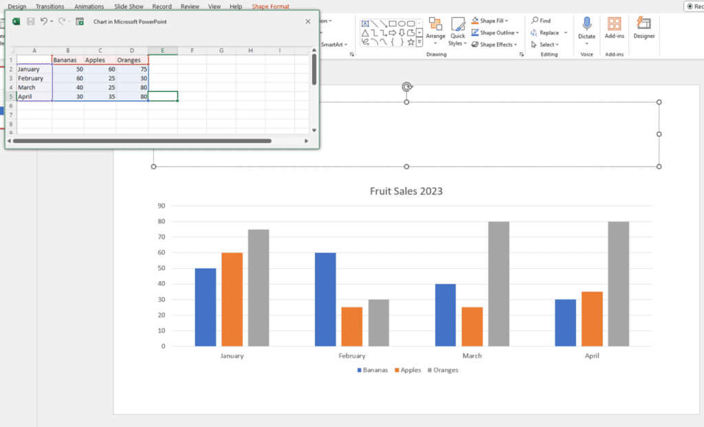
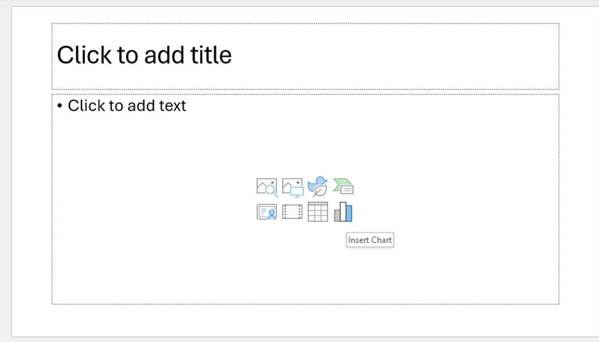
The second way to insert a chart is through the use of the content box on your slide. The content box on your slide is very useful and has a number of icons that you can use to insert something in to your slide. For this example we are going to use the insert chart icon.
In your content box hover over the 8th icon on the second row (the words Insert Chart should appear when you hover over it).
Click on this icon and a pop up window should appear with options for the type of chart you want. Choose the style of chart you require and click OK.
This will now insert in a ‘template’ chart as well as give you a small Excel window with the data that your chart has been created from. From here you can now edit the Series and Category names and also the figures to match your data. As you do this, it should update the chart behind on your slide.
Once you have done this, click on the cross to close down the small Excel window. This will then leave your chart by itself in your presentation slide ready to add any further details to it or a title to the slide itself.
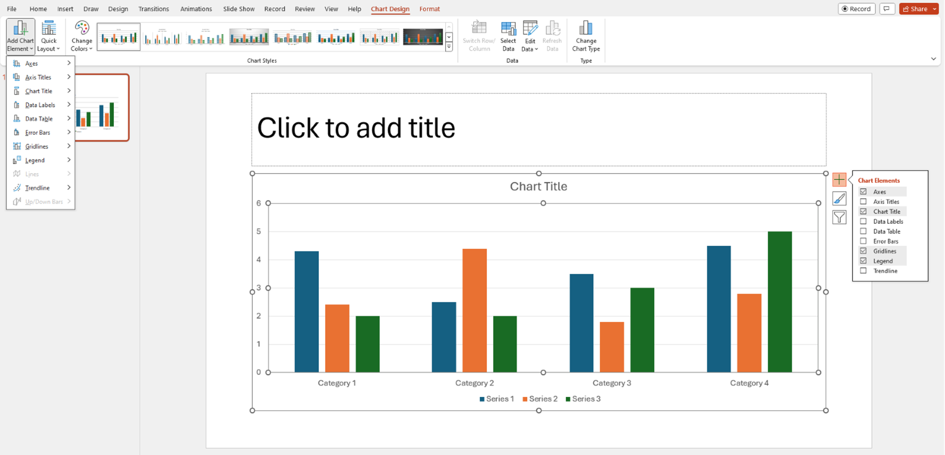
Formatting a Chart
Once you have your chart inserted into the slide, you can then format it. You can format the appearance of the chart by using the Chart Styles gallery on the Chart Design Tab. You can also manually format it by using the Format tab.
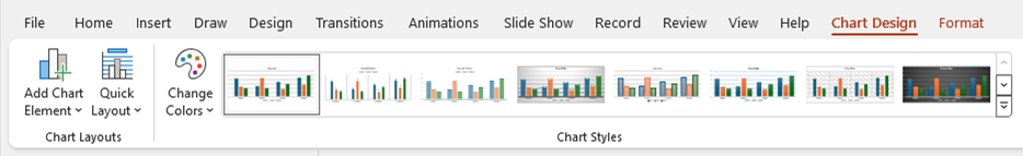
As well as formatting the chart, you can now add more detail to your chart. This is done via the Add Chart Elements option which is found either on the far left of your Chart Design Tab or by clicking on the cross top right hand corner of your chart itself. From here you will see that there is a list of options that you can add to your chart, for example axis titles or data labels.
The video below shows you how to insert charts using these two ways in your PowerPoint presentations. Charts are a good way of displaying information in your slides more visually or for showing trends in your data.
Take a look below at the video to find out more and then try them out on your own computer!
We hope you have enjoyed this hint and tip on inserting charts in PowerPoint. Why not take a look at our previous video hint and tip on how to insert a table into your presentations in PowerPoint?